Many of us spent our college years sitting in countless lectures accompanied by uninspiring PowerPoint presentations. The notes we took were equally uninspiring and weren’t remembered.
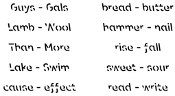
It’s a problem that doesn’t just affect students. Have you ever caught yourself re-reading the same article twice? To make text easier to remember, Melbourne-based designers partnered with behavioral scientists at RMIT University and have designed a font that makes reading more difficult.
Ironically named “Sans Forgetica,” the font is more difficult to read than most typefaces – and that’s by design. The ‘desirable difficulty’ you experience when reading information formatted in Sans Forgetica prompts your brain to engage in deeper processing.
To make your brain work harder to retain information, the font is legible yet broken and disconnected. Since chunks of words are removed, the brain is required to put more effort into reading, which only takes a fraction of a second – but this font seems to be working.
A recent study involving 400 university students found a small increase in memory retention when reading text in Sans Forgetica compared to Arial. The participants reading Sans Forgetica were found to remember 57% of the text, and only 50% when reading in Arial.
Although the font has promising statistics, it has limitations according to lecturer and Sans Forgetica co-creator, Stephen Banham. “You wouldn’t want novels printed in it. It would probably induce a headache,” Banham said.
It’s unlikely you’ll want to use it as part of your every-day reading, Sans Forgetica could be a handy type-tool for stressed-out students. You can download this free font here.


 RSS Feed

